Why you may need these tips?
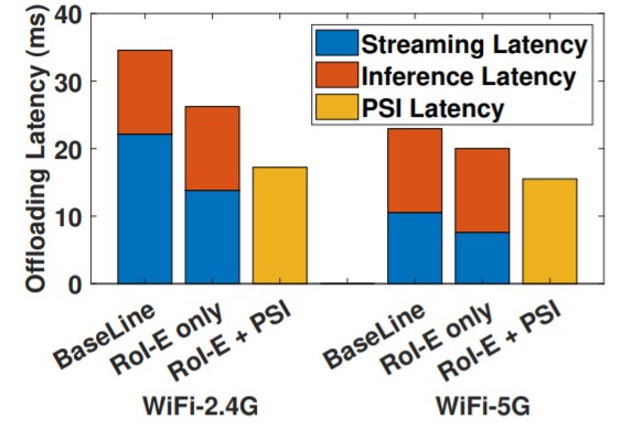
Let’s take AWStream as an example:

And this is one similiar figure from DDS:

which one would you like better?
Also, this is one of the figure from EAAR:
And this is one similiar figure from DDS:
which one would you like better?
In general, well-designed figures will bring extra benefits. It can deliver the information in a clearer way, make the work feel well-polished and also indicate that you have a good taste. So, let’s start!
Deliver simple correct message
First and foremost, the main function of the figures is to deliver the information. Try not to compromise the true information, even when doing so will make the figure prettier, or make your life easier.
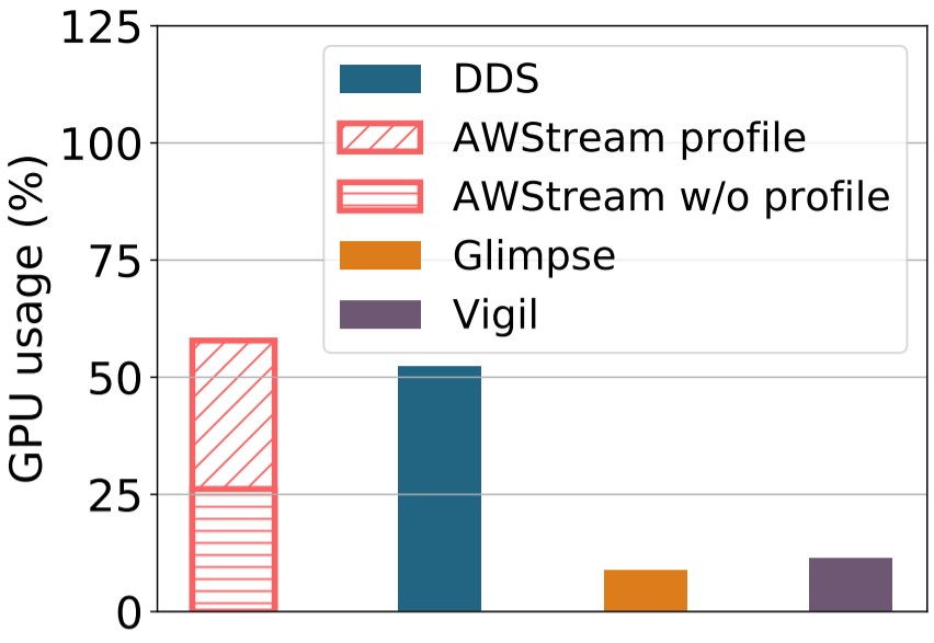
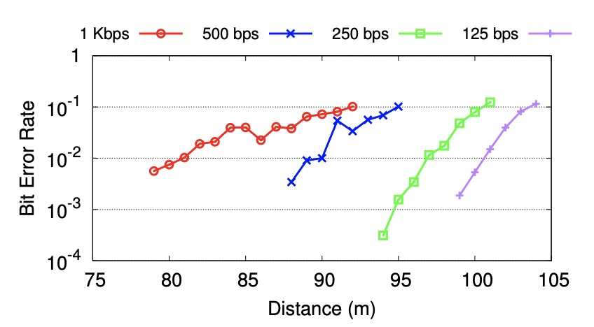
For example, one of the previous version of this figure:
is like this:
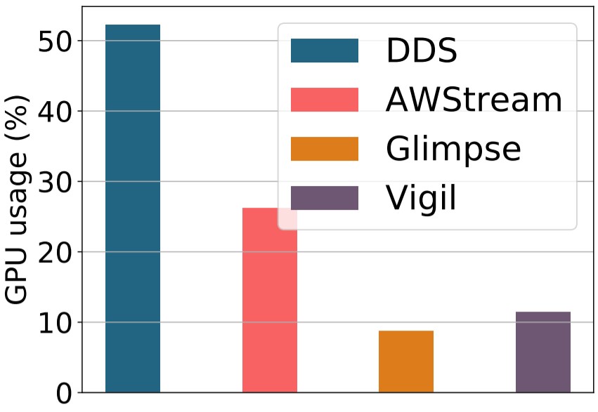
Though the latter is definitely more good-looking than the former (since in the former, the textures of the bars are not the same), it did not deliver the message that DDS is worse than AWStream if AWStream does not profile, and DDS is better when AWStream profiles. In this case, we need to choose the former one.
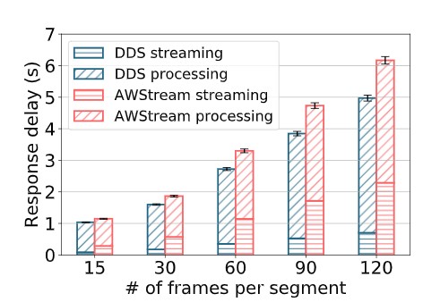
Let’s look at another example. This is one previous version that explains what is early reporting:
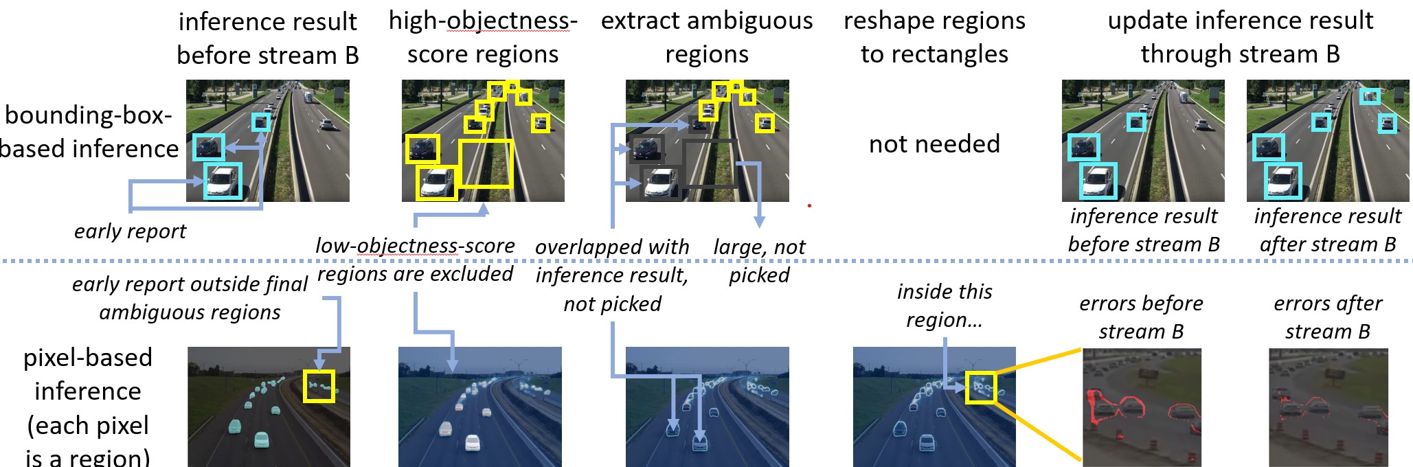
and after several iterations, this figure becomes:
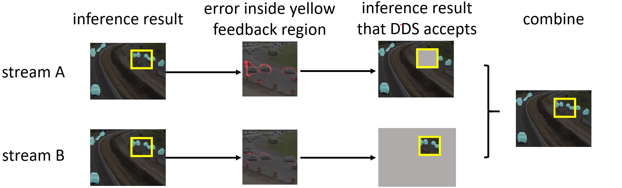
These two figures are all delivering correct messages. The difference is that the first figure tries to deliver too much messages, and the second figure just illustrates how the camera combine the inference results. In general, delivering too much messages will make the figure feel overwhelming, and will force your readers to slow down and reexamine the figure again and again (reread the former figure and check if this align with what you will react ![]() ). In this case, most people may just skip this figures, or even skip the whole paper. So it is also critical to keeep the message simple. The simple information will be the most effective information.
). In this case, most people may just skip this figures, or even skip the whole paper. So it is also critical to keeep the message simple. The simple information will be the most effective information.
Always check your figure in the pdf file of your paper
The second most important thing is to check your figures in the pdf file of your paper. This is because the figure will only occupy a very small area in the whole page. The area is so small that you are forced to “exaggerate” the fonts, the arrows and things like that to make it look better in the final pdf file (but typically look worse if you look the figure alone).
For example, the font seems too large in this figure

But in the paper, it looks much more better:

Also, only in the pdf file can you discover the inconsistency between figures. Like there is no grid in this figure, these three figures are not aligned, the coloring of this figure is not the same with others, things like that. This is crucial because consistency is an important distinguisher between amature figures and well-polished figures.
Shorten your end-to-end workflow
While plotting the figures, we always need to iterate again and again. Better tool choice will help us iterate much faster. For example, in this figure:
Imagine you use the .py file to write all these things. You finish the source code, switch to terminal and try to run it. Oh, errors. Then you switch back to source code, fix all of them, switch to terminal, generate the figures and open the pdf file. Oh, no grids and caption. Then you repeat all these things until everything looks fine. After that, you try to put the figures into the paper. Oh, the fonts looks so small. You repeat until everything looks fine in the paper and ask your advisor to check it out. He/She says please add a “better” arrow for it. And you repeat all the procedures all over again. Ah, what a tedious procedure ![]() .
. jupyter lab might be a better choice. By using jupyter lab, you just need to edit the source, hit shift+enter, and voila, the figure comes out.
Also, assume that you are drawing this figure:
What tool will provide sufficient alignment while providing sufficient aesthetic choices? My suggestion is powerpoint (powerpoint is really a good tool for illustrative things).
Choose good color
Take a look at one example from RetroI2V.
Imagine that you are working at, like, 10pm, really wanna sleep but you still have to present this paper for tomorrow’s meeting. And suddenly, this figure bumps out and emits those RGBs (especially that G)![]() .
.
To avoid this kind of scenario, please don’t use default colors (except for ggplot-style default) and choose your own color palatte. Color Hunt is an amazing website for this purpose. The color of the figures in the experiment section of DDS are all chosen from this website.
If you wanna dive a little bit into how to pick your colors, there are tons of videos about color theory in youtube. Pick one and watch ![]() . In general:
. In general:
- Lower the saturation and lightness of your color to make it less intense (ez)
- Be friendly to colorblind (medium)
- Contrast the color of your method and other methods (medium)
- The lightness between colors would better be close (hard)